Home  5  Books  5  GBEzine  5  News  5  HelpDesk  5  Register  5  GreenBuilding.co.uk
Not signed in (Sign In)

Categories


Green Building Bible, Fourth Edition
Green Building Bible, fourth edition (both books)
These two books are the perfect starting place to help you get to grips with one of the most vitally important aspects of our society - our homes and living environment.

PLEASE NOTE: A download link for Volume 1 will be sent to you by email and Volume 2 will be sent to you by post as a book.

Buy individually or both books together. Delivery is free!


powered by Surfing Waves


Vanilla 1.0.3 is a product of Lussumo. More Information: Documentation, Community Support.
Welcome to new Forum Visitors
Join the forum now and benefit from discussions with thousands of other green building fans and discounts on Green Building Press publications: Apply now.


    • CommentAuthorbarge17
    • CommentTimeNov 2nd 2022 edited
     
    .
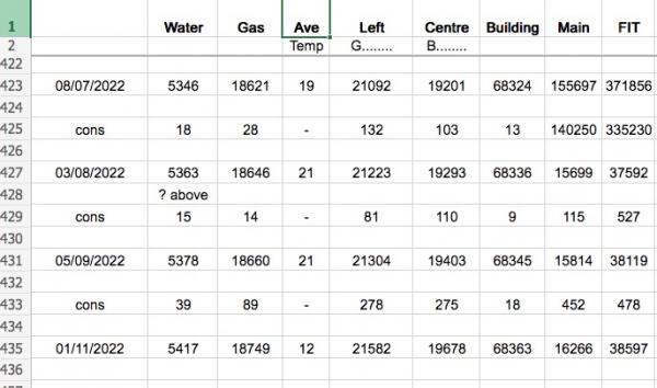
    For years I have been keeping a monthly record of our usage on a simple spreadsheet, screenshot attached. But it messy because each month I have to start a new row four rows down from the last month's, then copy and paste the formulae into the middle row between them.

    There must be a much tidier way of doing this. 20 years ago I used 'MS Works" and it had a database section where you could make a "card " or something which automatically transfered the figures to a spreadsheet, which could then in turn do some calculations and then generate graphs, etc

    I would also like to include units such as Therms and KWH and £s to make the records more usable. I hope somone can point me in the right direction, please.

    Nowadays I use either Dropbox or Google Sheets for this sort of thing and find them very good. thanks, D
    .
      Screen Shot 2022-11-02 at 11.35.27.jpg
    • CommentAuthorborpin
    • CommentTimeNov 4th 2022
     
    I do much the same except it is all on one line (so your 'cons' calculations are next to the data).

    In Excel select the whole row, Ctl-C, then right click on the selected line and 'Insert copied cells' - keeps all of the formulas correct.

    Over the years I have done various dynamic ranges so I can get a rolling average for the last 365 days (it isn't always the same number of rows).
    • CommentAuthorbarge17
    • CommentTimeNov 5th 2022
     
    "In Excel select the whole row, Ctl-C, then right click on the selected line and 'Insert copied cells' - keeps all of the formulas correct."

    Thanks, I double space them to make them easier to read. But how do you extract the consumptions to do things with them, eg make a graph, or take an average? because they always appear on a newly created alternate line. Possibly you set up the whole blank year in advance and fill in the readings as time goes on?
    .
    • CommentAuthorphiledge
    • CommentTimeNov 5th 2022
     
    Its a long time since Ive used the graph/chart function but Im fairly sure you'd need your data in rows or columns which you dont have. To get the dates all in one column youd need to remove the "cons" in column A. If you want you consumption to be the other axis then you'd need to only have the consumption figures in column B or move the consumption figure to a new column C inserted between the water and gas columns.

    I'm not sure what data youd want to average out but an obvious one would be your consumption per day rather than the consumption for a variable period which is somewhat meaningless when the period varies. To get the average per day for the period ending 1/11/2022, youd need the total consumption for the period divided by the number of days, so in cell B433 you would have =(B435-B431)/(A435-A431)
  1.  
    My favoured method of recording is Google Sheets because I can edit both at home and in the office and it's backed up to the cloud. I also occasionally play around in Microsoft PowerBI which has better ways of handling and graphing data than Excel.

    However, if you are more adept at programming, I understand those in the know often use Node-RED (https://nodered.org/) to post readings to Grafana (https://grafana.com/) which can make all sorts of clever dashboards.
    • CommentAuthorbarge17
    • CommentTimeNov 7th 2022
     
    .
    Thank you for your comments, I'll get back to this project soon and report here. I feel that Google sheets is very much like "Excel for the Web" which Dropbox uses, and also backs your work up on the web.

    I had a quick look at Node-Red and it's forum, etc looks well used and friendly. Might have a dabble on there. Last year I was dabbling with Arduino programming and found it all very user unfriendly. However, I built a wood boiler controller with it on a Nano and it works resasonably well.
    .
      excel.png
    • CommentAuthorLF
    • CommentTimeNov 7th 2022
     
    Building on Philedge comment.
    If you have data like this
    A B C D E F ETC
    Date water water cons Gas con ETC

    So A has all dates, C has all water consumption

    In excel, I use charts loads and have a simple method for getting them done quickly. Likely similar in web version.

    Click on date column then click on the columns you want to graph.(Directly on A, B etc. in header bit
    This will highlight the whole column,
    ( Or you can use ctrl and "wipe" over the data column by column till you have everything you want to chart)
    Then Insert chart , xy scatter and it will plot for you.
    You can move some series to right hand (secondary axis) if scales are very different

    Move chart to separate sheet/tab - then copy sheet to get different cuts on the data - deleting some items if you do not want them.

    Good luck
    • CommentAuthorbarge17
    • CommentTimeNov 8th 2022
     
    .
    thanks LF, now I am starting to get it. You said "Move chart to separate sheet/tab - then copy sheet to get different cuts on the data" - I have never used separate sheets ( nor realised it was possible) and I have always wanted to keep my data in one screen width to avoid scrolling, etc.
    .
    So I can use as many sheets as required for different purposes, just keeping my sheet No 1 for the raw data input?
    .
    good do
    .
    • CommentAuthorbarge17
    • CommentTimeNov 8th 2022
     
    .
    So in my screenshot at the top of this thread, the first two rows are fixed and always show at the top of my sheet even though I am now as far as row 438.

    If I delete the heading from those rows it will be awkward to be sure of filling in the readings in the correct cell. Or can I just use the data I want below the headings and tranfer it to the next sheet for processing?
    .
    • CommentAuthorLF
    • CommentTimeNov 8th 2022
     
    On view can turn off "split screen" I think it is or unfreeze screen
    Or can sometimes drag the bar with holding left mouse button down on the bars to the top of the page
    For the vertical bar drag the left of the page.

    You can keep the headings, these will be the test that comes up on the graph for the series (eg "Water cons")

    Only reason for extra sheets is the graphs over the appear over the data - you can move them but easier in a separate sheet. Can then print chart
    If you do all the data and set up nice axis and format,
    I then copy this master to new tab/worksheet and remove some of the data series just by clicking on them and deleting. I am on office / excel 2010 so not latest versions.
    Must be a youtube on drawing charts in your chosen spreadsheet.
    I did a lot of data manipulation in previous days and excel could always do it rather than needing to go to databases.

    You can link across worksheets if you have data on more than one sheet. press = then move to the point you want to use on the other sheet.
    • CommentAuthorbarge17
    • CommentTimeNov 8th 2022
     
    Thanks again, now I just to get on with it. cheers, David
    • CommentAuthorborpin
    • CommentTimeNov 9th 2022
     
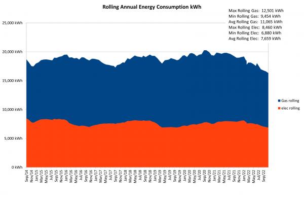
    I'll post a couple of screenshots. It has grown in complexity over time and I calculate things like Annualised cost per kWh, Rolling Annual Cost, Use by month etc. Calculating the rolling figure is a little complex as I don't always remember to take the reading and if something happens (like new meters) you get an extra reading.

    I also use number formatting to include the units (which then looks good on the graphs).

    Key thing is all data has to be on consecutive rows - remember it is data it isn't a presentation format.

    I recently added the ability to generate and display the historical Max and Min.

    I Keep fiddling with it :bigsmile:
      EnergyData.png
    • CommentAuthorborpin
    • CommentTimeNov 9th 2022
     
    Example graph
      Rolling AnnualEnergy.png
    • CommentAuthorbarge17
    • CommentTimeNov 10th 2022
     
    thanks, Borpin, that's exactly what I am working towards........
    • CommentAuthorbarge17
    • CommentTimeNov 17th 2022 edited
     
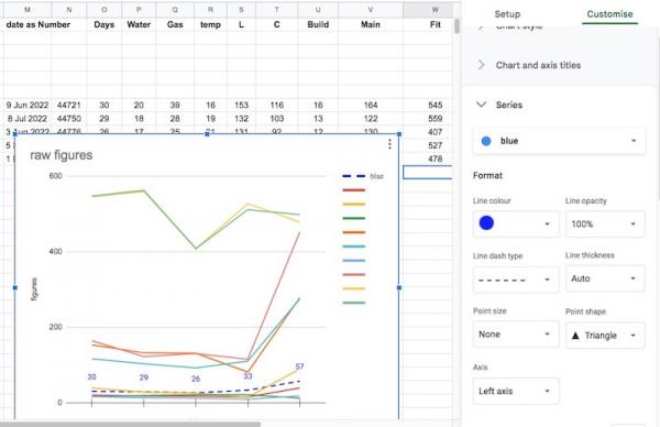
    I have got all the data into rows now and have made a trial chart, and I am amazed by the power of the programme (Google sheets) and how everything seems to be configurable.

    Having charts on new sheets is a transformation!

    A couple things I can't just find a solution for:
     Trying to customize the chart, I can't find how I got the label "blue" on to the dashed blue line, and it's not easy to see which column of figures each line relates to.

    Future charts will not have as many lines, there will be multiple charts with different data sets soon.
      edit chart.jpg
    • CommentAuthorphiledge
    • CommentTimeNov 17th 2022
     
    Maybe the blue label is showing because thats the colour youre edditting on the right hand side of the page?? Try selecting a different colour to edit and see if a different label appears
    • CommentAuthorLF
    • CommentTimeNov 17th 2022
     
    Nice work sir.
    In excel you click on the series of data you want to change the colour and format of. So say the orange line. One click only. Then right mouse then format data series.

    If numbers very large for one series can move them to secondary (right hand axis) to let you see the smaller data easier. this is on format data series on excel as well.

    If you delete the rows between the data labels at top and the actual data and include the data label in the selection of data/numbers it will bring it in. Or go to edit data and you can normally find it in there.


    Keep working on your aster chart and then all the formatting will be there. Then copy the sheet with the master chart - expect google is same as excel. Click on the series/lines you want to delete and hit delete and they are gone from chart and legend.
    • CommentAuthorbarge17
    • CommentTimeNov 19th 2022
     
    .
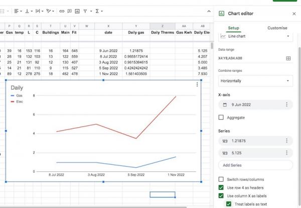
    Getting there slowly now, I have more or less got to grips with daily usage and the chart editing. I have extended the rows on sheet1 to include columns for the dailys and unit conversions, so now I need to convert the gas readings to Kwh - I'll get the conversion off the bill. Then make yet another chart.
    .
      Chart Editor.jpg
    • CommentAuthorborpin
    • CommentTimeNov 20th 2022
     
    Posted By: barge17gas readings to Kwh
    kWh - Watt is a person so it is a capital.

    Sorry, just one of those things that bugs me and yes, it's a hill I'd die on.
  2.  
    I suspect barge17 knows that but their autocorrect was trying to be helpful, and moved the capital letter to the start of "kWh", at least mine kept on doing that.

    My autocorrect also just tried to autocorrect "autocorrect", which it thought should be "AutoCorrect".

    I prefer MJ as the unit of energy (also capitalised, but with lower case k or upper case G). kWh is a ridiculously unscientific unit, it's guaranteed to cause confusion between work and power, and whoever thought of using h obviously didn't check what the universal unit of time is.

    But I worked with two theoreticians, one of them thought that all thermodynamic energy should fundamentally be expressed in electron-volts as that is what it really is. The other thought that mass and energy are equivalent and so energy should be measured in kg.

    I gave up on being pedantic about units after that, it was just no fun anymore, so I am fine with whatever units anyone wants to use, and however they spell them, if the meaning is clear enough.
    • CommentAuthorbarge17
    • CommentTimeNov 21st 2022
     
    .
    Point taken about the units, thanks.

    Looking at our gas bills, I couldn't work out how they had done their conversion from M3 to kWh but, for the time being, I have worked back the calculation from this web site which means I am multiplying the cubic meters by 32.156307 to get the kWh. https://www.theenergyshop.com/guides/how-to-convert-gas-units-to-kwh
    • CommentAuthorLF
    • CommentTimeNov 21st 2022
     
    Hi. Conversion looks wrong. It is about 10 kWh per m3 of gas.
    Just looked at link, think you have the imperial number.
    • CommentAuthorbarge17
    • CommentTimeNov 23rd 2022
     
    Thanks LF, correct, I now have worked it out at 10.108 kWh per m3.
    • CommentAuthorborpin
    • CommentTimeNov 25th 2022 edited
     
    Posted By: barge17Thanks LF, correct, I now have worked it out at 10.108 kWh per m3.
    The calorific value changes (slightly) over time and is different in different parts of the country (IIRC). There *will* be an explanation of the calculation and the calorific value on your Bill.
    • CommentAuthorbarge17
    • CommentTimeDec 22nd 2022 edited
     
    .
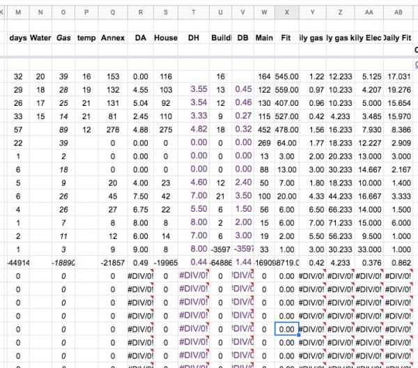
    Further down the line, I can now manage charts for existing data, but I have been trying to make a chart ready for a longer time period, with blanks for data to come, but that means the formulas are not happy with no zeros allowed, etc.

    Perhaps there is an elegant solution? But so far it escapes me, and It is a drag making a fresh chart each time I want one with up - to -date data. Meantime I shall colour the colums I want for the chart to remind me which ones to use.
    .
      Screen Shot 2022-12-22 at 12.23.57.jpg
    • CommentAuthorphiledge
    • CommentTimeDec 22nd 2022
     
    You can use the IF function to do a test before you execute the formula thats generating errors, eg-

    In column R youve got a value of 0.49 with an error under it. I dont know what formula youve got in that cell but let's say its doing something with the 0 in the cell to the left. In the cell with the error use the IF function to test if the value to the left is 0. If its 0 the result would be " " which displays nothing in the cell. If its anything other than 0 then run the current formula.

    What Ive written will likely not make much sense until you read up on the IF function!!
  3.  
    Another option is =IFERROR(abcde, "") and replace abcde with your formula. You’ll get the result, but if it's an error, then the cell will just stay blank. "" is two sets of quote marks with nothing between them, which is the symbol for a blank cell.
    • CommentAuthorbarge17
    • CommentTimeDec 23rd 2022 edited
     
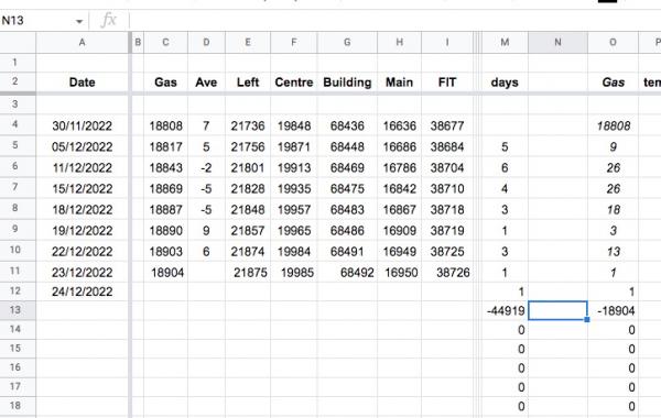
    More good advice thanks, I went for the easier option and copied in =IFERROR(A12-A11, "") and it worked immediately, but it threw up another issue, ie the negative numbers in row 13 which moves down as each day's meter readings are entered:
      Screen Shot 2022-12-23 at 08.58.33.jpg
    • CommentAuthorbarge17
    • CommentTimeDec 23rd 2022
     
    .
    so I'm guessing I need two IFs in the cells affected? ( or an IF and an OR)
    • CommentAuthorphiledge
    • CommentTimeDec 23rd 2022
     
    Those negative numbers were in your previous screen shot so not related to adding the IFERROR function.

    When you paste in a screen shot make sure the cell youre talking about is selected and the formula in that cell is displayed at the top of the page- its a bit difficult to understand whats happening if you can't see the data. Also make sure the column and row references are in the screen shot- they are in the last shot but not the one before. Makes it so much easier to comment!
   
The Ecobuilding Buzz
Site Map    |   Home    |   View Cart    |   Pressroom   |   Business   |   Links   
Logout    

© Green Building Press